Developer Tools
RepoLens
AI-powered GitHub repository analytics platform.
Overview
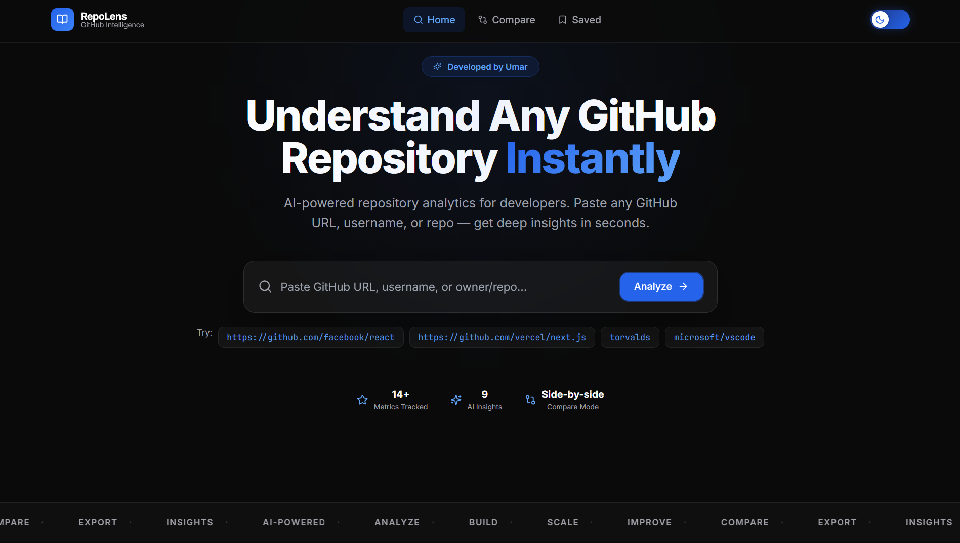
RepoLens turns any public GitHub repository into a readable story — insights, code statistics, contributor activity, commit trends, and language distribution, surfaced through interactive visualizations instead of raw API output.
Problem
GitHub's own UI shows activity in fragments — commits, insights, and contributor graphs live on separate pages with no unified narrative. Understanding a repository's health or a contributor's real impact means piecing it together manually.
Solution
A single dashboard that pulls repository data through the GitHub API, layers in AI-assisted analysis, and renders it as interactive charts — commit trends over time, language breakdowns, and contributor analytics — so the full picture is visible in one view.
Features
Repository insights dashboard with code statistics
Contributor analytics and activity breakdown
Commit trend visualization over time
Language distribution charts
AI-assisted summary of repository activity
Architecture
React + TypeScript frontend consuming a Node.js/Express API layer that proxies and caches GitHub API requests, with Tailwind CSS for styling and Framer Motion driving the chart and panel transitions.
Tech Stack
Screenshots
Challenges
Working within GitHub API rate limits while keeping the dashboard feeling real-time required careful request batching and caching on the Express layer.
Lessons Learned
Designing for data that arrives in uneven shapes — some repos have rich history, others almost none — pushed a more defensive, empty-state-aware UI approach.
Next project
Cricket Auction Simulator